Today I learned about a new python module called HiPlot. It uses a simple yet powerful visualization technique to uncover patterns and relationships in a data set. Uses cases are for example to identify the relevant features for a ML algorithm, to obtain decision rules for classification or to analyze the impact of hyper-parameters on a key metric.
I used the Iris data set to demonstrate this: The basic idea behind the visualization technique is that each observation in the data set is represented by a line that connects the different dimensions by their respective value.
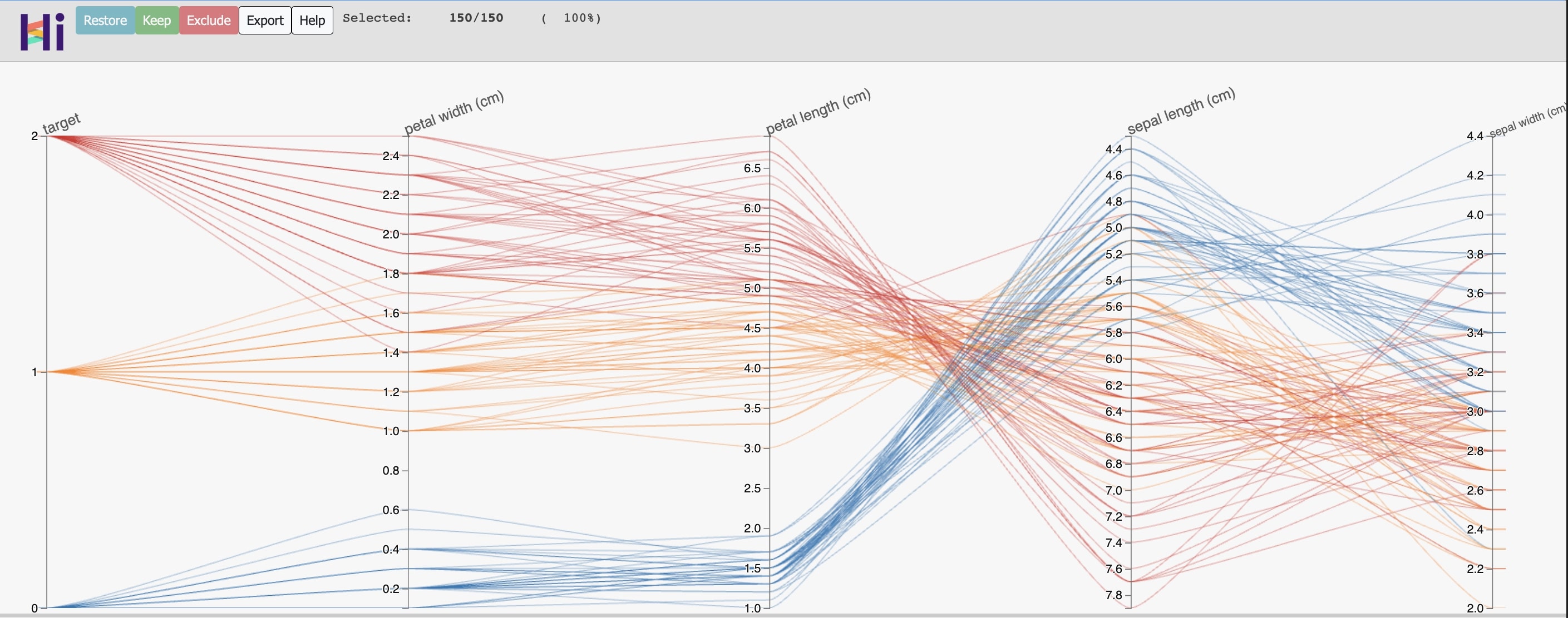
In this case there are four different dimensions and a target variable on the far left which can have three different values (0, 1 and 2). It’s now very simple to build a set of hard rules that assigns the observations to the respective class. The cool thing is that the plot is interactive which helps us exploring. It’s possible to re-order the dimensions to our liking. Also, you can focus on only a certain area of the plot by clicking and dragging around a certain range of a dimension. This will remove all the unselected lines and simplifies the plot a bit.
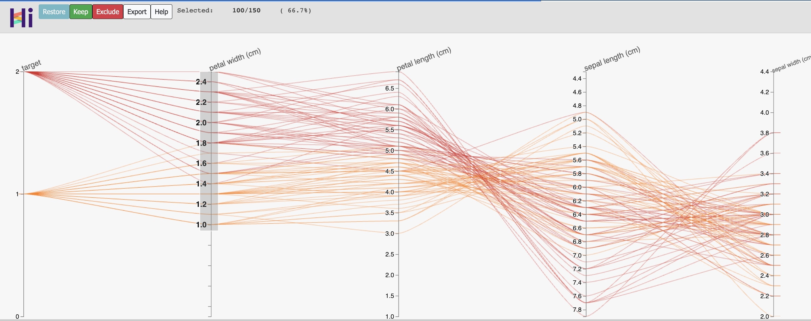
Using this we can derive some decision rules that classify the data set quite well:
- If petal width < 0.8, then classify as class 0.
- If it’s not class 0 and petal length > 5, then classify as class 2.
- Otherwise classify as class 1.
Of course this method might fail if the number of dimensions is too large or if the data becomes too complex. But there are certainly cases where this will help you to get a first impression on a data set or to eyeball the rough relationships.